

Topical Thursday #4: Cycles
Topical Thursday #4: Cycles
The first rule of cycles is... everything is a copy of a copy of a copy.


I could spend hours and hours and hours talking about cycles analysis. It’s been one of the single greatest additions to my trading toolkit. I admit it will be a challenge to break it all down into a bite-size email but I’ll do my best to give you a concise and descriptive enough explanation of cycle analysis to allow you to make use of the charts I post in the future.
Patterns are everywhere, in so many things we do as humans, and are observable in the natural world. To think that they don’t exist in the markets is naive. There are many different patterns one can observe in the markets, think wedges or flags, price action candle patterns engulfing or hammers/stars, waves, Fibonacci, and cycles just to name a few. Cycles in my opinion are among the most underrated and underutilized and misunderstood patterns in the market.
There are three pretty simple reasons why I think it doesn’t get much credit. First, it involves more math than many methods because it is not as easily identifiable through visual inspection compared to seeing a wedge or flag pattern. the second reason is the language is just a bit less accessible. Here are two quotes I pulled from some articles.
“The actual support level identified, coupled with Fibonacci retracement, suggests the presence of strong buying opportunities in the near-term.”
“The magnitude of the first six frequency patterns and the statistical significance of the Q-score suggest the presence of a high-frequency predictable component in the stock market.”
These two statements are preparing the reader for the same potential trade setup, but I’ll bet most folks are glossy-eyed from the second quote. Finally, cycle analysis is detached from price predictions where most other patterns incorporate some way to determine a potential price target. Cycle analysis is anchored to the time scale, not the price scale. The tangible price forecast of other methods proves to be more desirable than timing provided by cycle analysis.
The simplest explanation of the cycle analysis to be presented is a measure of the oscillations in sine waves. Increases and decreases in price action are often repetitive. When given historical data and a computer the data can be analyzed finding the peaks and troughs of the sine waves, determine the frequency and amplitude, and find repetitions of the same oscillations or groups of oscillations to create cycle models. Here’s a graphic depicting a sign wave creating a perfect cycle.

This database of repetitions and groups of repetitions can be used to create forecasts of potential tops and bottoms of the waves IF the price action continues to play out in a manner similar to prior historical oscillations. The more often a cycle appears in history the more significant it is in the potential validity of the forecast.
Before I bore you to death with let’s get to an actual chart. Here we have a composite model of two dominant cycles for BTC right now. A composite just means it consists of more than 1 cycle. The cycle lengths are displayed at the top, an 89-day cycle and a 40-day cycle. The 40-day cycle is one of the most repeated cycles in BTC’s entire history. The 40-day cycle essentially means a period of 20 days of bullish price action and 20 days of bearish price action. The composite model combines the two cycles and adjusts the larger and smaller cycle peaks and troughs based on the amplitude (strength) of the cycle. I’ve labeled the chart with it’s components. The jagged line is the line plot of BTC daily closes. The wavy line is the price cycle forecast, linked to the TIME SCALE on the bottom of the chart (NOT THE PRICE SCALE ON RIGHT). I’ve added green and red stars to show cycle peaks and troughs.
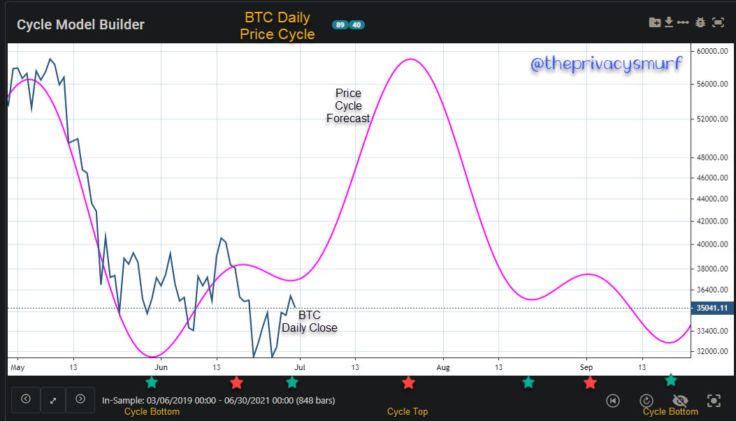
The deciphering of the forecast above would be something like this.
The composite model of the BTC Daily Price Cycle is showing a short-term 40-day cycle bottom near the end of June which will rise in sync with the mid-term 89-day cycle peaking sometime in late July. The short-term cycle may plot a rally from mid August through early September before the mid-term cycle bearishness plays out bottoming some time in late September.
One could simply buy at cycle bottoms and sell at cycle tops or alternatively short at cycle tops and cover at cycle bottoms, but that’s not advised as all models and forecasts are erroneous until proven to be true. Cycles aren’t static and are constantly changing. While I create a model forecast for a quarter I usually look at an updated picture every week or two. I’ll revisit the past quarterly model each new quarter to see how close my models were to the actual price action so I can modify my techniques and analysis in the future.
So if it’s not advised to simply buy at forecasted cycle tops and bottoms how does a person benefit from this? As I’ve stated before price action is king. I use price action triggers to time my entries at cycle bottoms and exits at cycle tops. Here’s last quarter’s model.

The forecast showed that the prior bullish price action fit with a long-term cycle that would be topping out and would have bearish price action starting sometime around late March through the end of May. Since the model could be wrong and the price could just blow straight through and continue bullishness I went to the charts.
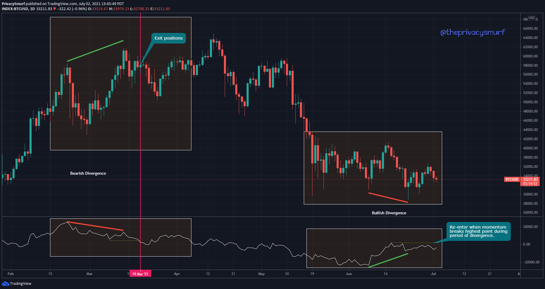
The large boxes on the left depict the period of time that the long-term cycle is peaking. Bearish Divergence on the Momentum oscillator provides for a simple price-action trigger to validate the forecast. The high on price in mid-March coincided with a lower reading on momentum showing that buying pressure was waning. A common entry cue for divergence is to execute the trade when the oscillator crosses the lowest or highest point during the period of divergence. The yellow dotted line shows the lowest reading during the period of bearish divergence in March. On the 19th momentum closed below the lowest reading and signals the entry to the short position or the exiting of long positions. While the trade did take some heat as price continued up into April it ultimately played out as forecasted. The large boxes on the right depict the period of time that the long-term cycle is bottoming. In this case, Bullish Divergence on the Momentum oscillator provides for a simple price-action trigger to validate the forecast. This is a perfect example of how forecasts can be off. The initial forecasted bottoming period showed no divergences in price and momentum even though price action did follow the forecast with a rally and decline in June. The low in price at the end of July aligned with a higher measurement of momentum setting up a bullish divergence. An entry signal would be when momentum closed above the highest reading during the period of divergence annotated with the yellow dotted line
Let’s get back to the current model.

The bullish divergence shown above is still in line with the updated short-term cycle bottom, it’s just waiting for a cue for entry. There are other methods that could be used for entry if that trigger never happens but I tend to rely on divergence the most with cycle analysis. I’d be watching for setups of bearish divergence on the 8HR, 12HR, and daily chart starting in mid to late July. Since the cycle is only a mid-term cycle of 89 days I wouldn’t expect a daily chart to have an entry condition. The daily chart triggers will typically appear on longer cycles of +100 days. In cases of extreme price increases/decreases, it can occur though.
I’ll provide a model that includes the current long-term cycle that we are bottoming in. For the 204-day cycle, I’d be watching on the daily chart for bearish divergences starting in October. This cycle however will be updated for Q4 in October so this is super speculation. I don’t expect it to be exactly on target but it’s good to have an idea ahead of time. The shorter cycles show the mid-term 89-day peaking around August and short-term cycles peaking in line with the longer cycles and also in early September and late November. In the short-term cycles, I’ll watch for divergences on the 4HR and 6HR charts for bullish and bearish divergences to time those rallies and declines.

I know that’s a lot to take in but luckily you can read over this again and again. If you have any questions feel free to leave a comment. I do have a section about divergence and how I find and measure it on my website. If all this makes sense to you and you have a desire to learn more aside from my updates reach out to me and I can connect you to the resources needed to learn more, but I’ll warn you now it’s a lot and it’s VERY time consuming and comprehensive. I’m constantly working to improve at it.
Thanks again for your patience. Life has been quite involving. I’ll drop a Micro Monday post tonight or tomorrow and then we’ll be all squared up for the Sunday Synopsis. I appreciate your support and flexibility.
@theprivacysmurf