

Topical Thursday #9: Money Flow
Topical Thursday #9: Money Flow
Dominance not so dominant...


Take a look around the space and you’ll probably hear plenty about Bitcoin Dominance. While it is something to be aware of it’s often used in isolation and assumptions about it and its effects are much more complex and actually reliant on other metrics. Today we’ll talk about dominance, why I think it’s something that can be bypassed in your analysis, and what can be used in its place for a better way to understand the money flow in the crypto space and how to properly expose your portfolio to different assets.
Here we have the crowd favorite, Bitcoin Dominance, labeled BTC.D in tradingview. Put simply it is measuring the total market share BTC has across the entire crypto market. If the total crypto market had a market cap of $1 trillion and BTC Dominance was measuring at 75 then you’d know two things, the BTC market cap would be $750 billion (75% of $1 trillion) and the rest of the coins in the entire crypto space would have a combined market cap of $250 billion (25% of $1 trillion). That’s simple enough.

There are plenty of murky concepts circulating about what a certain Bitcoin Dominance % means to altcoin price behavior and altcoin seasons (whatever time span) or what an increasing or decreasing dominance means. In my opinion, forget all that right now. The BTC.D chart gives an incomplete view in the larger macro context. Side note, it is a macro-level tool so if you are looking at the picture on anything under a daily timeframe you are doing it wrong. Here are some incorrect things I’ve heard that maybe you have as well.
Bitcoin Dominance decreasing means BTC is decreasing.
That’s clearly not true. Below we see BTC Dominance (left chart) decreasing while BTCUSD (right chart) goes up, then dominance increases and BTCUSD continues to go up.
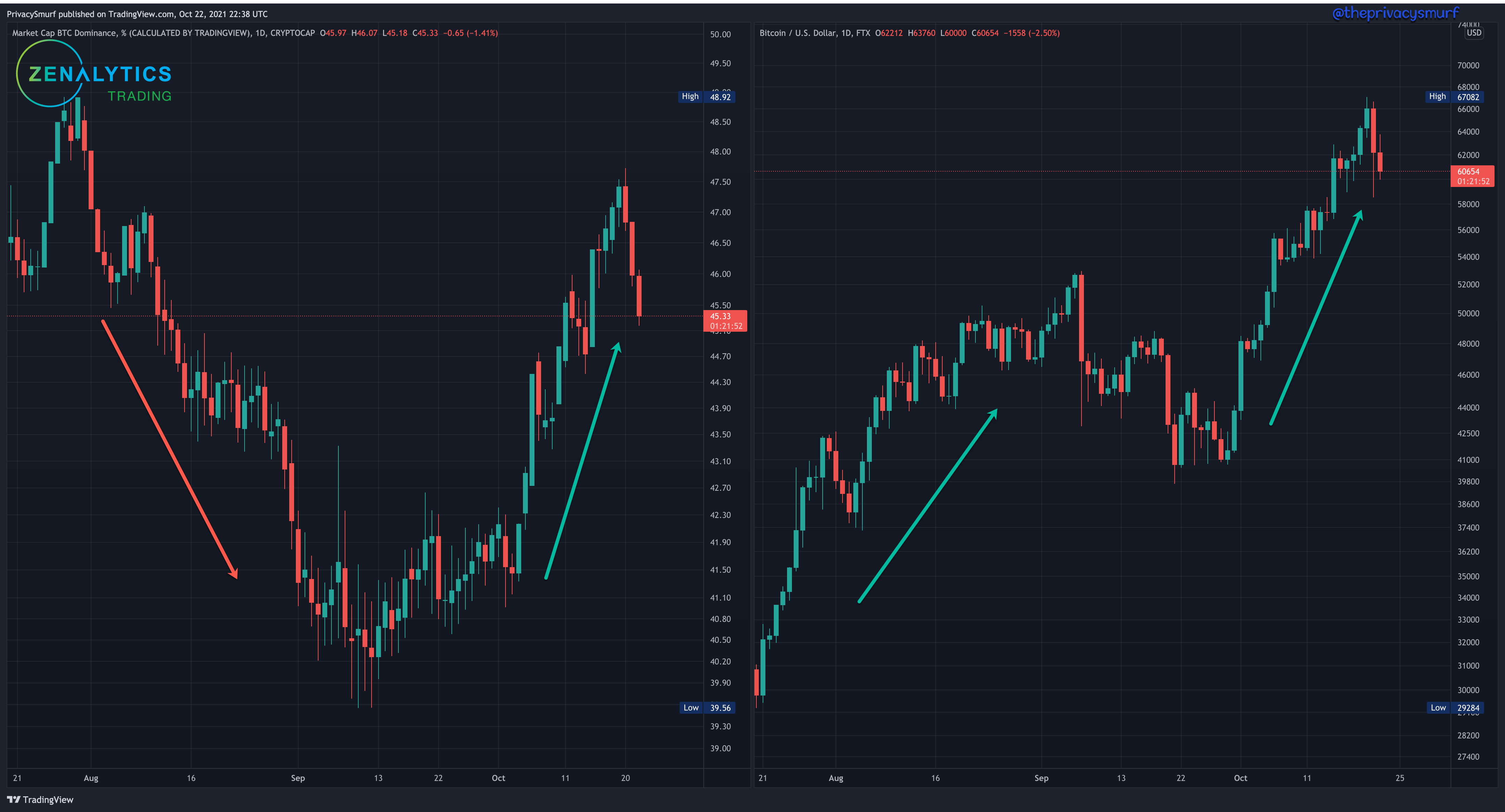
Bitcoin Dominance is just showing how much money is going into BTC relative to the rest of the market, it doesn’t necessarily have any relation to the price of BTC.
Bitcoin Dominance increasing while BTC increasing means altcoins will be decreasing.
This is a “yes and no” answer and we are gonna highlight the ‘no’ part first. Below we see BTC Dominance (left chart) increasing on the left and BTCUSD (top right) increasing. Under BTCUSD we have ETHUSD and FTX Indicies representing mid-cap altcoins (MIDPERP) and small-cap altcoins (SHITPERP). There’s not really a hard and fast rule for this classification but you’d probably be fine considering market caps of +$50bil as large-cap, $5-50bil, as mid-cap, $1-5bil as small-cap, and -$1bil as micro-cap. Despite dominance increasing along with BTC it’s clear to see ETH and altcoins are all increasing as well.
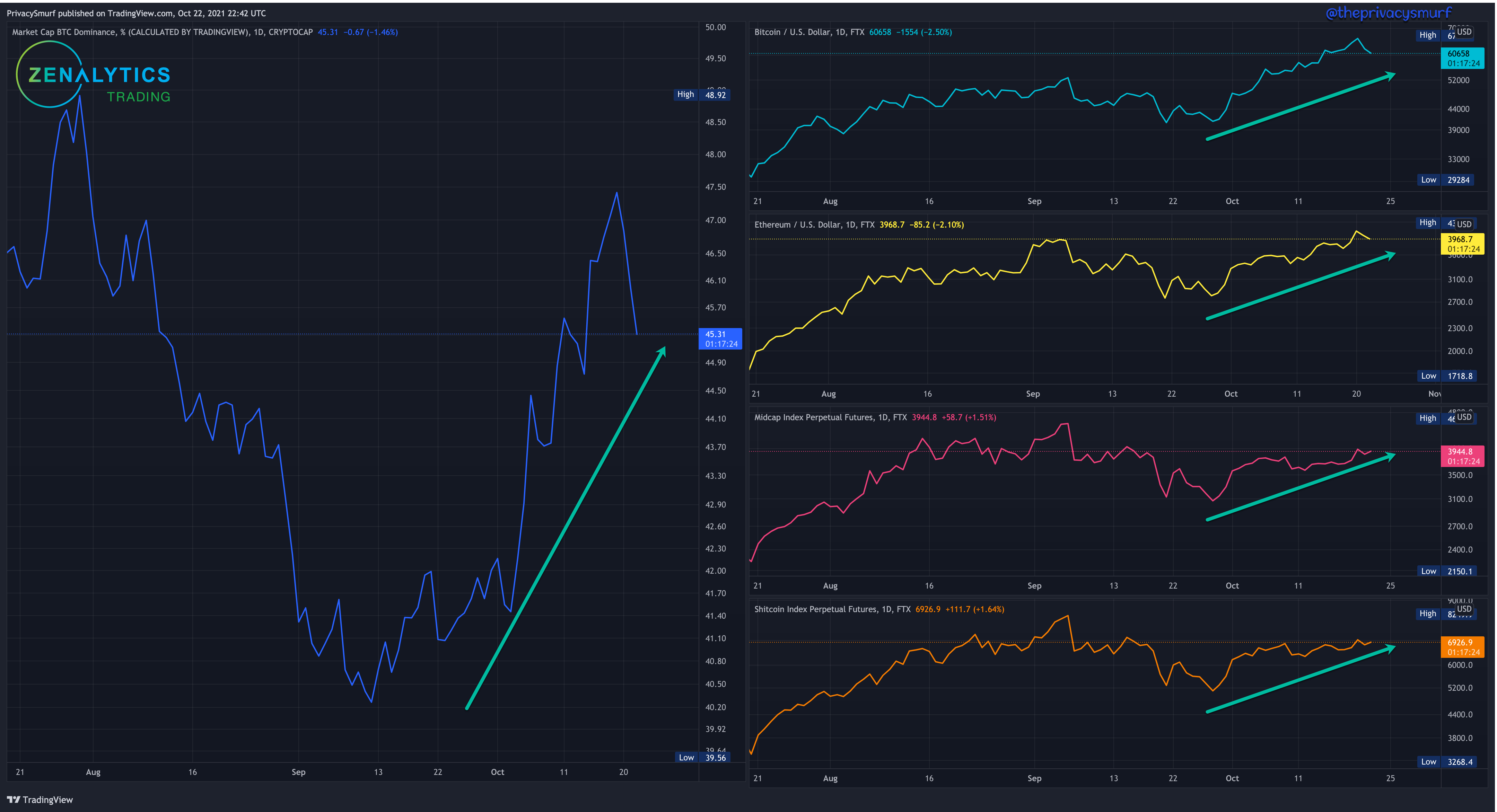
Bitcoin Dominance is just showing how much money is being allocated to BTC. It can tell you more money is coming into the market but can’t tell you where it is moving, also as the first example showed, it doesn’t necessarily have any relation to the price of BTC or alts.
Bitcoin Dominance decreasing and BTC decreasing (or stable) means altcoins increase or altcoin season.
This is a “yes and no” answer and we are gonna highlight the ‘no’ part first. Below we see BTC Dominance (left chart) decreasing on the left and BTCUSD (top right) non-trending and relatively stable. Under BTCUSD we have ETHUSD non-trending and relatively stable, mid-cap altcoins very volatile and non-trending, and small-cap altcoins slightly trending up.

Bitcoin Dominance in decline can mean one of many things, not just a rotation to altcoins. It can’t tell you where money is moving, can’t tell you if it’s leaving just BTC or leaving the market as a whole, also as the first example showed, it doesn’t necessarily have any relation to the price of BTC or alts.
The above statements can be true if you compare altcoins to BTC instead of USD.
Bitcoin Dominance increasing while BTC increasing means altcoins will be decreasing.
This is a “yes and no” answer and we are gonna highlight the ‘yes’ part now during the same window of time as above. Below we see BTC Dominance (left chart) increasing on the left and BTCUSD (top right) increasing. Under BTCUSD now we have ETHBTC, mid-cap altcoins (MIDPERP/BTC) and small-cap altcoins (SHITPERP/BTC) all on the decline relative to BTC.

While the above statement is true, this value relationship to BTC and behavior can be determined without the need to look at the dominance chart.
Bitcoin Dominance decreasing and BTC decreasing (or stable) means altcoins increase or altcoin season.
This is a “yes and no” answer and we are gonna highlight the ‘yes’ part now during the same window of time as above. Below we see BTC Dominance (left chart) decreasing on the left and BTCUSD (top right) non-trending and relatively stable. Under BTCUSD we have ETH/BTC decreasing, mid-cap altcoins(MIDPERP/BTC) very volatile and non-trending, and small-cap altcoins (SHITPERP/BTC) trending up. During the largest decrease of Bitcoin Dominance (red box on left shown by white arrow) it is clear that the flow of money went purely into ETH (green box on right shown by white arrow).

Again, Bitcoin Dominance is improved when you begin to compare relative values of BTC to alts but it still leaves a lot of room for error in assumptions.
Enter the Crypto Money Fountain Chart ← chart link
This chart can keep you tapped into the money flow way better than the Bitcoin Dominance chart. The link above is a shared version of my chart. Regardless of your tradingview subscription you can click that link and see what I see/do. If you have one of the higher subscriptions you can make a copy of it and change it to suit your preferences, but lower subscriptions will limit how many chart windows you can have on one screen.
Let’s check-in again real quick and look at the market how most folks do, on the USD denominated charts. We can see BTC hitting the gas pedal but everything else is relatively flat.

Let’s say you bought or were told to buy alts after BTC broke out on Oct 6th because alts are sure to follow in the move, you’d have made a relatively bad move. Looking at the Crypto Money Fountain chart, where the market is denominated by BTC, you can see that everything that’s not BTC has declined. You could have waited for a bullish divergence to appear (green arrows) to buy your alts (on the yellow arrow). Buying on the 6th and waiting for the alts to make their move, maybe you’d be in profit but maybe you wouldn’t. You for sure would be technically doing worse and would have had a higher % return in profit if you had just bought BTC.
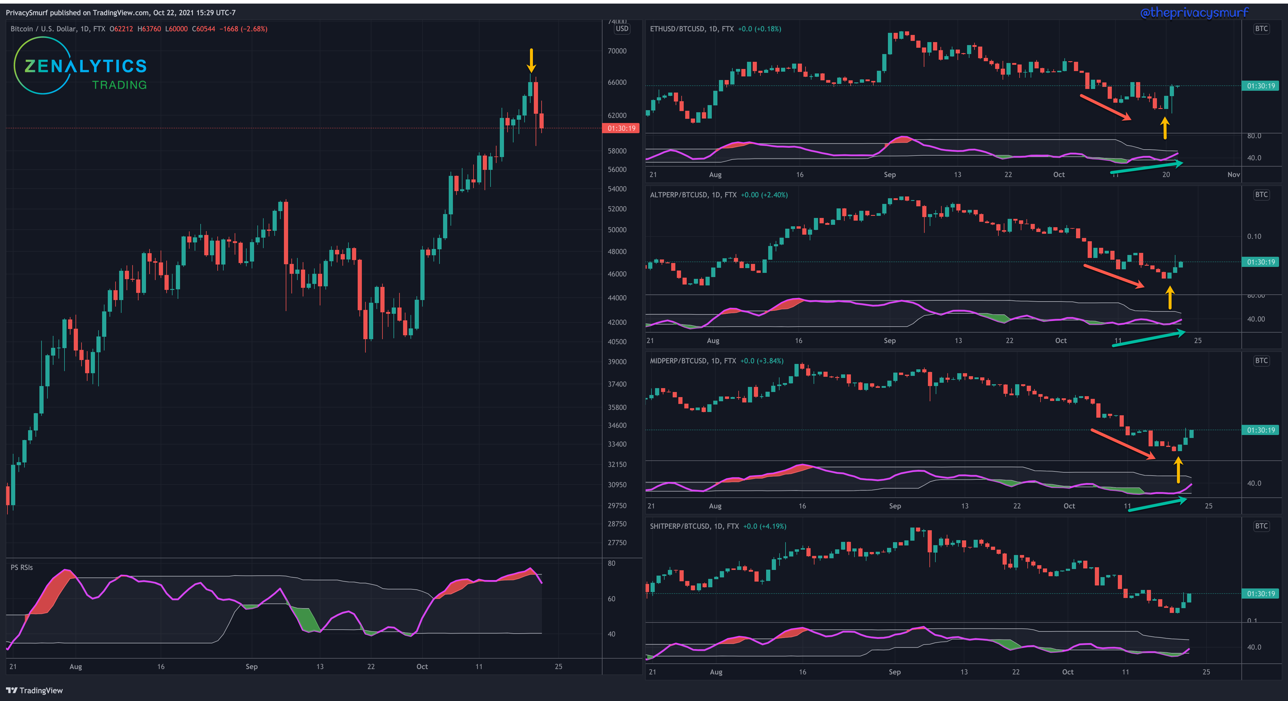
One thing to note is the goal for me is to stack sats. I’m always exposed to BTC and will trade from alts to BTC and BTC to alts. Ultimately, I will sell out of a majority of alt positions (except for my diamond hand full conviction coins) if it appears they will lose more than BTC will. It doesn’t matter if this is not what you do. Even if you buy with USD or sell back to USD the process would be the same and the signals can and often will be the same as I’ll show later.
Let’s go back in time to show how this can be useful for getting out of the market. You’ll need to follow the numbers on this one. Yellow first, small-caps (Red 1) kinda do their own thing.

1 & 2: BTC and RSI set a new high.
3, 4, & 6: BTC sets a higher high but a lower high on RSI, bearish divergence, prices will likely fall, however at the same time the rest of the market is not in bearish divergence and signaling a continuation of increasing prices. (Yeah I messed up in the numbers, gimme a break.)
5 & 7, 8, 9: BTC sets a lower low. This is a consolidation signal, but the market sections are still setting new highs and showing relative strength.
10-13: BTC sets a new low close below the previous low close. This is a confirmation of a bearish trend and a good exit sign for the alt market. You’d be escaping before most of the reduction in price relative to BTC.
Red 1 and Yellow 14: Low-cap coins will often be tied with BTC at the beginning and lead the charge with alts and have the highest pump at the end of the cycle. This can be for many many reasons that one can speculate on but that’s not really important. It’s more important to acknowledge that this phenomenon occurs.
Here’s the USD denominated chart with the same numbering.

Some important things to note on this chart:
The entire market relative to USD retraced at the 3,4, & 6 point. This is why it’s important to pay attention to the BTC relative charts instead of just USD. The market here is in line with the oscillators from Apr 12-21. There would be no technical reason on these charts to expect the alt market to rebound as it did to new highs instead of following btc to lower highs before dumping, while it’s very clearly a bullish move away from BTC on the other chart.
Bearish divergences in early May are more apparent on the USD chart.
The exit signal from Yellow 10 when BTC sets the lower low close to confirm bearishness, most of the alts had retraced from the highs here where they were still all at highs on the BTC denominated chart. That means that your coin is performing better than BTC and worse than the dollar. If you sell your alt you will get fewer dollars than you would BTC. If that’s confusing here’s a post all about it.
As with most stuff I post I know this is a lot. I’m happy to entertain questions you may have. One I think you may have is why are there no prices on the chart? Well, they aren’t important, to be frank. First off, the charts aren’t tradable assets specifically, and also it’s not really about prices, it’s about understanding the relationship between the charts. The typical flow is from left to right, top to bottom. Divergence, candle patterns I like, support and resistance, and trendlines also all apply here as well when doing analysis.
When the left chart is going up and all the others are going down you shouldn’t be buying or trading alts against BTC (unless you are shorting). BTC is absorbing all the money coming into the market. Alts will be going down when BTC goes up and when BTC goes down alts will go down farther.
When the left chart is going up and all the others are going up, the entire market is on the rise. Look for coins that belong to the market cap that is going up the most, but be sure to watch for failure across the market, from top to bottom.
When the left chart is going down and all the others are going up, this is moon time when stuff gets stooopid and won’t last forever. Look for coins that belong to the market cap that is going up the most, but be sure to watch for failure across the market, from top to bottom.
When the left chart is stagnant or going down and the others have been going down but are trending up this can signal the beginning of altcoins separating from and outperforming BTC. Look for confirmation signals on the specific section chart and on coins in those sections that have the same signals. If MIDPERP shows a bullish engulfing candle above a trendline then look for the best performing mid-cap altcoins that are showing a similar pattern. These are higher probability positions to take.
When the left chart is going down and all the others are going down GTFO (whatever that means to you). To me it means I cash out alts (except my forever holds) to BTC to staunch the bleeding. Overall, I’m not concerned with the USD value of BTC, I just want more and more to save for later. If this is occurring during a cyclical peak I will sell out 20% of my BTC to buy back in dips at a cycle low but for the most part, I always want BTC exposure, just in case I’m wrong and it rockets away from me
Cheers,
@theprivacysmurf
Wow. Excellent article!!! Read it a few times today, just to be able to absorb the content. I'll be referring to this article frequently.
Thanks... Steve
This feels like four year of continuous study packed into a couple pages. Well done.