

A Tale of Two Bitcoins
A Tale of Two Bitcoins
It was the best of times, it was the worst of times...

I need to be clear right off the bat, this isn’t a literal reference to the Dickens stories. The connection and reference are titular only.
So much time is spent trying to predict the future. There’s so much data and history available at our fingertips for analysis. Still, it’s difficult to come to conclusions about what that future will be. What I try to do is create lots of ideas of what the future will be. Then I’ll create checklists of events that must happen to make that future a reality. As time moves forward and events happen (or don’t happen), boxes are checked (or not), and the pool of possible futures is diminished. All my trading and investing actions are dominated by risk. As the pool of potential futures gets smaller and smaller the risk of acting on one decreases as well. Once the risk has fallen to an acceptable level I act on the potential future I think has the highest probability of occurrence.
We are at the precipice. There are more than two possible scenarios with Bitcoin, but I think, and many other analysts would probably agree, the two most important and impending macro future scenarios are:
1) A breach of the current all-time high and parabolic rally before the years end
Or
2) A test near the current all-time high and failure leading to a new bear market.
I’m going to make my case for both. To be upfront I don’t think there’s enough data to make a call for one happening over the other. As pointed out in my thread the other day, consolidation around 50k, increasing average volume, and increasing momentum would shift the odds toward scenario 1 for me but that has yet to formalize so it’s still a 50/50 in my books.
OK. So here we go. My cases of two Bitcoins. There are a few things that exist in both cases so we’ll go over those first.
Both Scenarios:
I talk about cycles all the time because out of all the things I’ve learned over time they have historically been the most accurate foundation for analysis.
A simple overlay of a BTC mid-term daily cycle shows a cyclical price peak around mid-November. This particular cycle has high statistical relevance. Buying at a cyclical low and selling at a cyclical high would have bet a profit 83% of the time through BTC’s complete history. That’s not really an argument case for either scenario because that just means the cycle peak has to close above $30k to be in line with the odds.

The composite overlay shows a more detailed picture in case you are interested in a closer look.

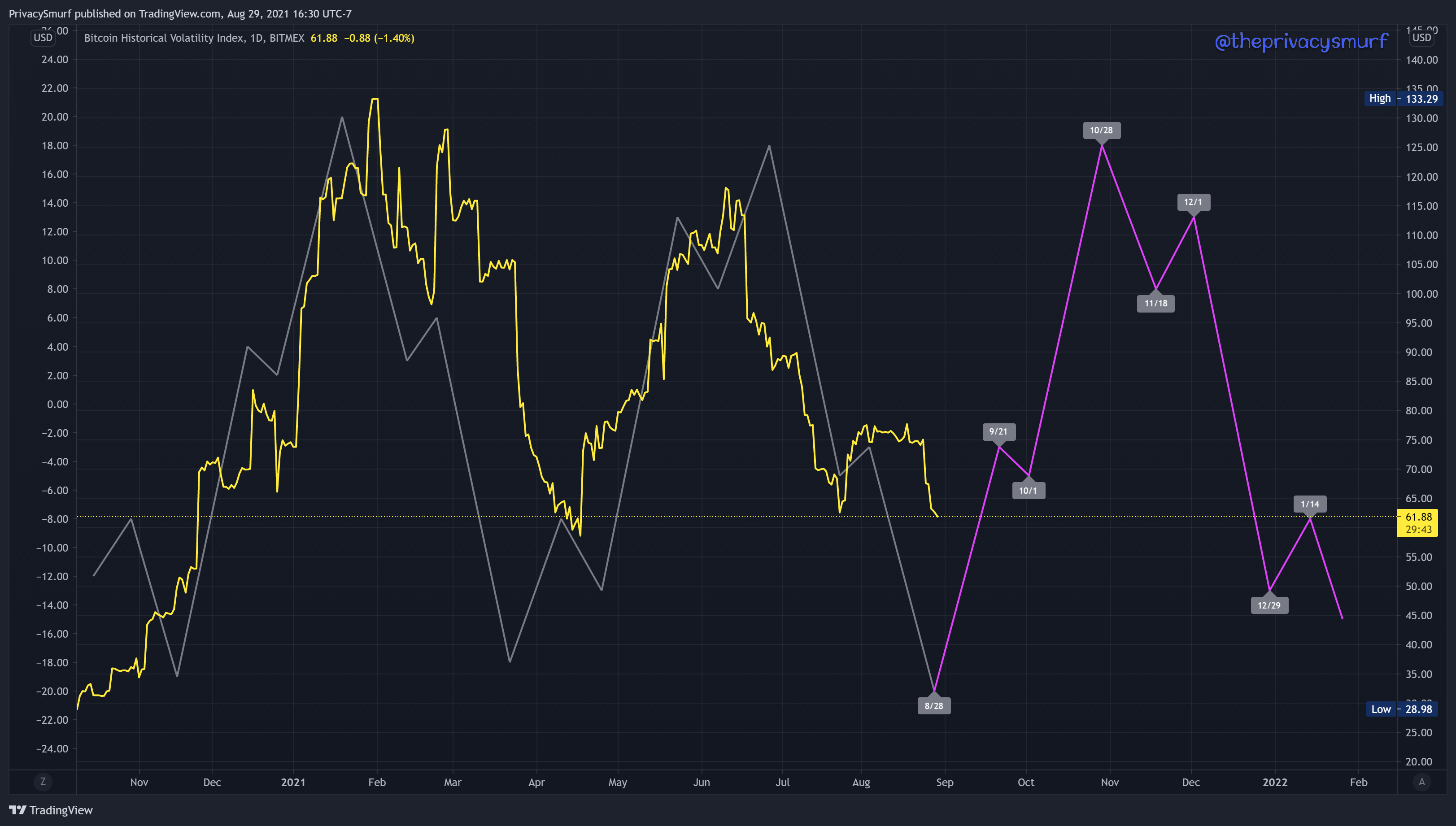
The Bitcoin Volatility Index at its core is a measure of price fluctuation. This data also shows statistically relevant cycles. This index shows that price fluctuations could become the greatest in late October. This also does not give more credibility for either scenario, as price fluctuation and volatile movement can go either way as I’ll present for each scenario later.
Scenario 1: Up, Up and Away
The biggest reason supporting BTC going up and past a new time high is simple, people are buying it. The more people are buying, the less available supply, the more expensive it gets. Whales continue scooping up BTC and sending it off to HODL wallets. Each bubble is a large outflow. The larger the bubble the larger the outflow. Regardless of BTC being “expensive” whales are more than happy to buy it for later.

Looking at the buyers using the Volume Profile despite spending less time at $50K it’s just as much buy volume as $40K. More people are in the line of thinking that 40K was the springboard and won’t be seen again before the next leg up and buying the breakout.
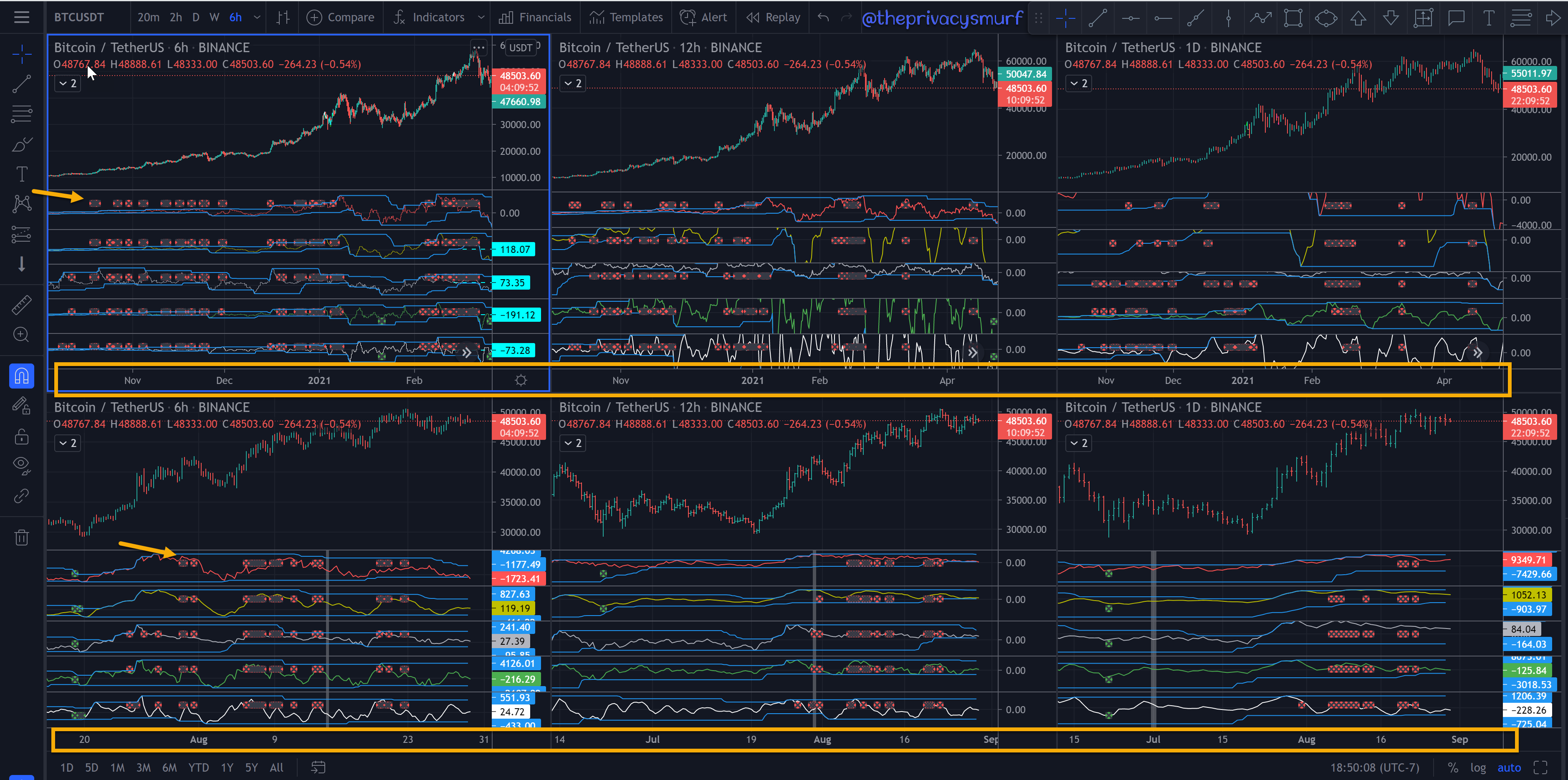
This next chart is really loud but I’ve pointed out the important parts. This is a divergence tracker I use (that I really need to optimize to look better). It’s got 5 different oscillators. When divergence is present it plots those little red dots marked with the yellow arrows. The important part about that is noticing when they are all starting to stack up across multiple timeframes. The second important and probably most important part is the timespan marked by the yellow box. The boxes left to right of BTC are the 6HR, 12HR, and Daily charts. The top boxes are in a timespan PRIOR to the retracement earlier this year when bearish divergence began to appear. The bottom boxes are a timespan AFTER the retracement when bearish divergence began to appear. The thing to note about the top timespan is those bearish divergences took all the way from November to February before the correction. This is typical of technical indicators when emotion and irrationality take over on the runs to extremes. Bearish triggers show up but get invalidated or stopped out as more and more excitement takes over. The bottom boxes have just started stacking up divergences but prior bullish cycles had MULTIPLE rounds of bearish triggers prior to the top. This is a contrarian signal for more gas in the tank for a runup even though there are bearish setups IMO.
Time for the hypothetical for Scenario 1 revisiting the Cycles and Volatility Index. I’ll stack them on top of each other with the notes inside so you can look back and forth.
The cycles and BTC price chart above show a near-term peak around the 9th of September and a rally starting sometime around the 19th of September. The BTC Volatility index below shows a peak in volatility around the 21st of September and another large spike peaking on the 28th of October. I could picture a test of resistance (maybe the $53K mark) with the price cycle peak in early September. A retracement (or possibly accumulation) into mid-September to account for the still increasing volatility. The price of BTC begins a rally to test the resistance again. A break of that resistance in late September begins the runup to test the $60K mark. Volatility increases as prices fluctuate all through October as bitcoin tests and breaks the all-time high and move with intensity to new highs into the eventual peak. in late October. Volatility is still high but decreasing as selling is steady into mid-November. Price starts a new rally as BTC tries to test its last high but this is the dead cat bounce, the macro double top, and the start of the bear market at the end of the year.

Scenario 2: Move on, nothing to see here.
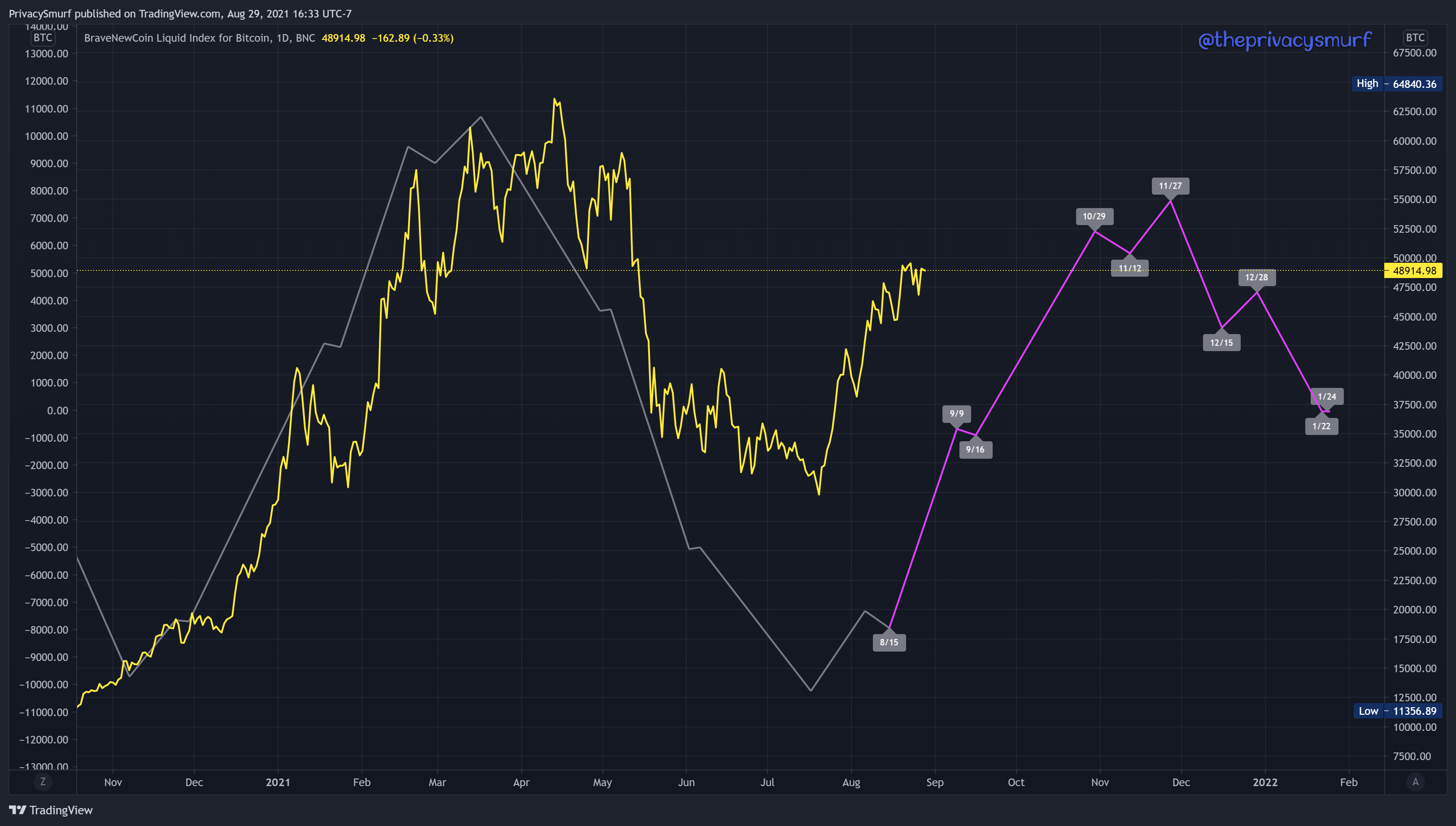
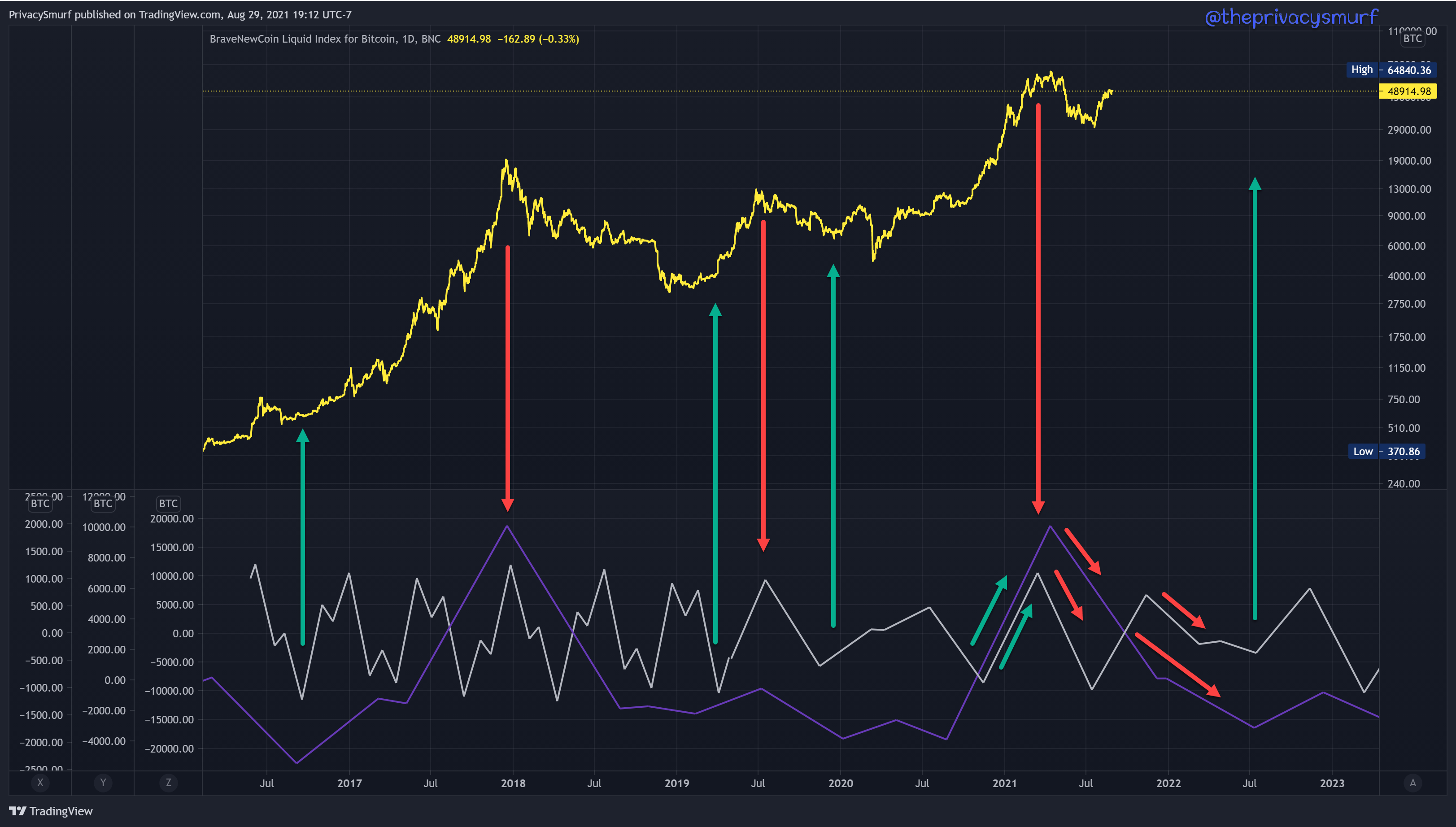
I’m gonna make you mad/confused here because I said the daily cycle was in both scenarios but overlaying multiple timeframes paints a pretty bearish picture. Below you can see the daily chart of BTC. The price line is on the top and the cycles are on the window at the bottom. The dark line is a WEEKLY long-term cycle and the light line is a composite of a mid-term and long-term DAILY cycle. I’ve added arrows to highlight the important parts. Cycles on different timeframes can be ion different phases at the same time. A weekly cycle can be bullish while a daily is bearish. When that happens often you will see that the higher timeframe will mute the lower timeframe. Bullish waves in daily cycles won’t be as strong because the weekly cycle is working against it. Similarly when multiple timeframes cycles are in alignment prices will move faster and stronger. The runup to $64K had daily and weekly cycles working in agreement. They are in disagreement at the moment. This could prevent a breach of all-time highs and on that failure they will be in agreement and both are bearish. Also, note when daily and weekly cycles were in alignment at tops and bottoms. The visit to 64K had a near-perfect alignment of multiple timeframe cycles. This hasn’t been a great setup for BTC bulls in the past.
This next part I put in the bearish scenario but it’s only just barely and that’s mostly speculation, but that’s what we are all doing anyways so it’s fine. This is some pretty neat stuff though. This is a chart called HODL Waves. It represents the current circulating supply and who’s been holding it for how long. The colored waves at the top represent holders for a longer span of time than the waves at the bottom. I’ve put arrows by the waves that I think are the most important with the current macro picture.
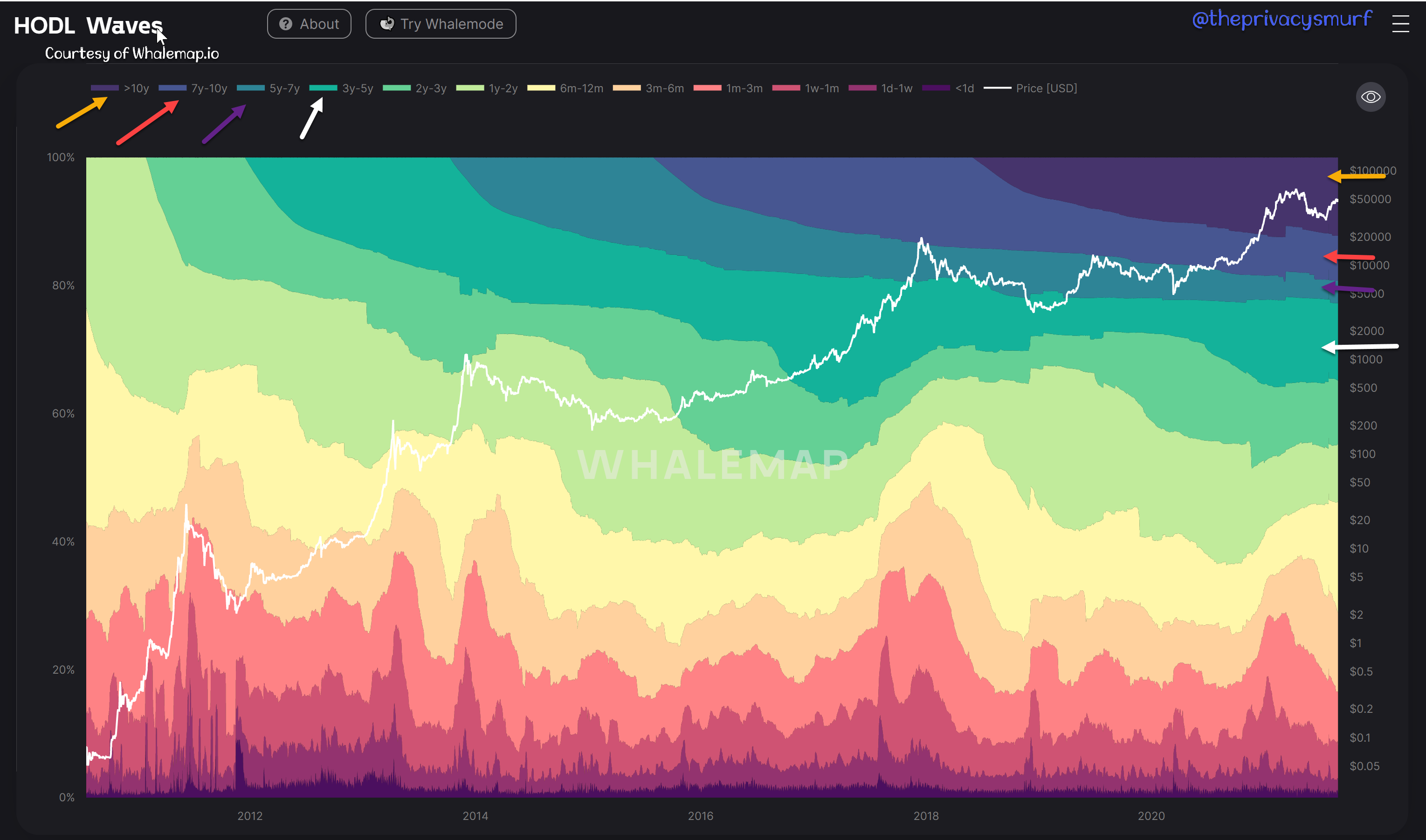
The top yellow band is coins that haven’t moved for over 10 years. These are coins that haven’t moved since BTC was a measly $0.08. The interesting thing about these coins is there hadn’t been very little decrease until BTC got over $60K. At that point, a not insignificant percentage of coins left that pool into a smaller wave. That is abnormal for sure. There had been no realization of gains for over 10 years. What has changed? Why make moves now? Is there something that those coin holders know that others don’t?
The red band coins held and unmoved for 7-10 years. These are coins from around the 2011 peak. The interesting thing about these coins is the percentage saw a decrease from the pool around the 2013 peak as hodlers likely realized gains after buying the top of the previous cycle. As these coins weathered the bearish period in 2013 and saw another parabolic peak in late 2013 there wasn’t a decrease in the percentage of the pool. Maybe those holders were less starry-eyed about the gains and converted to true believers and expected good things to come soon. Little did they know there was a multi-year bear market. Funny enough (IMO) there was a percentage decrease from the pool at the peak in 2017 and again at the recent peak. These hodlers are seemingly thinking a bearish market is on the horizon as the pool percentage has recently decreased.
The next band down contains coins from around the bottom of the 2014 bear market These holders had never been through a bull market. There wasn’t a significant decrease from the pool in 2017. There was however a decrease at the first dip to $50K after touching $60K. These coins are from hodlers nervous about having missed the top and are locking in profits from where they believe is the backside of the bullrun.
The final band of note marked with the white arrow is coins from around the 2017 peak. There was also a decrease from this pool around the recent rally nearing $50k. It’s my thought that these hodlers are picturing this as the dead cat bounce before the bear market.
Time for the hypothetical for Scenario 2 revisiting the Cycles and Volatility Index. I’ll stack them on top of each other with the notes inside so you can look back and forth.

The cycles and BTC price chart above show a near-term peak around the 9th of September and a rally starting sometime around the 19th of September. The BTC Volatility index below shows a peak in volatility around the 21st of September and another large spike peaking on the 28th of October. I could picture a test of resistance (maybe the $53K mark) with the price cycle peak in early September. A major retracement with BTC eventually failing near $45K into mid-September to account for the still increasing volatility. The price of BTC begins a rally to test the resistance again at $48-49K. A break of that resistance in late September begins the runup to test the $53K mark. Volatility increases as prices fluctuate all through October as BTC tests the $53K mark with a false breakout and fails (or accumulates there in a range from $50-53K) eventually falling in late October. Volatility is still high but decreasing as selling is steady into mid-November. Price starts a brief relief rally as BTC tries to make its last gasps but this is yet another capitulation bounce, the macro double top is in, and the start of the bear market has been confirmed already.

Those are two scenarios I think are both very likely and there’s plenty of evidence to support both. The price targets are VERY rough and I’m just picking numbers to tell the story. What scenario do you think fits the current market? What data-driven criteria are you considering that I haven’t mentioned? Let me know.
As time carries on I’ll certainly be keeping you all informed on my thoughts and market bias. See you all in the next post! I hope you all enjoyed this wild conjecture, haha. You won’t get it from me much.
@theprivacysmurf
Also... its interesting the four months of divergent signals from Nov 20 to Feb 21, where divergence was overwhelmed by market emotion, the fear and greed index (https://alternative.me/crypto/fear-and-greed-index/) moved up in Nov, started to falter in the middle of Jan, dove, recovered and then dipped even at BTC was hitting ATH in April. What to do with this? No clue. If you sold out based on the second F&G dip (Feb 28) you lost a 30% BTC upside, but avoided a 34% downside. ug. that went nowhere. nevermind.
Hey I think I noticed, the overlap of daily vs. weekly cycles seemed to have a stronger impact when both Daily & Weekly were high, vs. when both daily and weekly were low. Result of that might be to to watch for the harmonious upward wave to indicate a period top, vs. harmonious bottom indicating bottom?